6 pendant light designs to consider for your space


Remember a couple of weeks ago we were speaking about pendant lights and their magic?! Well, many of you asked us how you can choose the “right” pendant light in your spaces which led us to get a little bit deeper in the world of pendants for today’s blog.  You will be able to use it as a guide when choosing your pendant light(s). Pendant lights have been starting to get more and more attention, chandeliers have definitely taken the back seat, but they still have a seat. For now, we are going to cover six different pendant light designs and we are sure after reading this you will know, at least which of the six to look for that will fit your space and design. With no further adieu. Drum roll, please!


DRUM PENDANT

DRUM PENDANT

First runner up who else than the Drum Pendant. Drum roll, drum pendant, get it? Not funny?! Fine. Like the name itself, drum style pendant lights have a shade resembling drums, usually a stretchable material over a circular metal frame. We tend to primarily suggest the drum pendant light for ambient lighting – always depending on whether or not the bottom of the shade is open or closed. We love using the drum pendant for the dining room. Yes, we know it can be used in most spaces in your home. At DM Designo we seem to like it best above the dining room table it defines the space, becomes a showpiece, as well as it creates a cozy ambient with its light. Bonus: darker colour shades will let less light shine through.


MINI PENDANT

MINI PENDANT

From the drum roll now to the minis. The mini pendant is a pretty straightforward pendant light option. If used independently they are best for task lighting as they are a focused source of light and we love them in the powder room. However, these beauties can be multiplied and used in a straight line across your island kitchen counter or clustered together for ambient overhead lighting.

Do not be fooled by their size, as you can see they demand attention, are quietly dramatic , and can be part of every design. Not only in the Scandinavian aesthetic ;). Bonus: the longer the cord light the better for high ceiling spaces.


BOWL PENDANT

BOWL PENDANT

Then there are our bowl pendants may be the most functional option and that is why you see them Every. Where.

Apart from its functionality, the bowl pendant option can be found no matter the colour, texture, size, design, shape you are looking to complete your space aesthetic.

💡 It’s simple design wins the most designated task lamp in the pendant family.


GLOBE PENDANT

GLOBE PENDANT

The child of the bowl pendant (at least that’s how we see it) is our next pendant light – the globe pendant! Easily guessed this pendant receives its name from its round shape. If you are looking for a mid-century style look no further.

This was made for you in the late 1950s and ’60s and it is waiting for you to take home and complete your design flawlessly.

Similar to the mini pendant you can use multiple at a time alternating the heights to get a dramatic effect.  


The exposed bulb when asked likes to be naked. It came naked and strong a few years ago and it doesn’t seem to be slowing down or covering up anytime soon. At DM Designo we often consider this pendant light when designing industrial, rustic, and minimalist spaces.

These bold guys are great for ambient as well as task lighting. The best part, they are quite budget-friendly. Bonus: Their minimal design is perfect of DIY projects, you are waiting to partake in : )


EXPOSED BULB

EXPOSED BULB

MULTIPLE PENDANT LIGHT

MULTIPLE PENDANT LIGHT

Do you want to create a lighting installation in your home? The multiple pendant lights will make that easily happen!


Remember the bold naked beauties we mentioned they can be the perfect choice for an artistic arrangement that will look trés chic especially in foyers, but who are we kidding they will look as snazzy over dining tables and above kitchen islands. 


Bonus: When placing them always remember that the goal is to balance, you need the light coming in to be distributed.


So, ladies and gents, which pendant light are you? We would love to know, comment below, and if you have any questions feel free to post it here as we will answer them as soon as we can.


With lots of love and light,
Signature.png


BLOG GALLERY


The Psychology of Colours in Interior Design Projects


Some of you might be thinking, what does psychology have to do with colours. Believe it or not, not only does colour affect our psyche so do our spaces, and that is why we want you to know how important it is when choosing colour for where we live and work.


We would love to be able to get into all of it with you, but a – we don’t have the time, and b – we are not sure you will read it all. So instead we have picked a layout that will be the most useful way, for you the reader, to use when choosing colour for your walls and it will help with your decisions when choosing them to create the intended atmosphere in each of your spaces.


Let’s start with the basics, I know we already know but a refresher can come a long way. After all, school is a much-faded memory, for most of us at least. But, whose counting the years. We definitely are not! So, the basics – PRIMARY COLOURS! What are they?


They are the basis of all colour - red, yellow, and blue. Combining these colours will allow you to create every other colour, BUT you can’t create these colours by mixing any other colours. The secondary colours are created by combining the primary that gives us our green, orange, and purple. Finally, there are the tertiary colours red/orange, blue/green, etc. Got it?! Great! Now we can go to the good stuff, a breakdown of each colour and it’s effects and use.

 
Dark Night Paint HGTV HOME by Sherwin-Williams; Midget Farrelly Surfing Shore Break, Makaha,1968, by LeRoy Grannis; Deva Velvet Platform Bed $1,310 Lulu and Georgia; Organic Mattress Avocado Green Mattress; Custom-Dyed Bedding&nb…

Dark Night Paint HGTV HOME by Sherwin-Williams; Midget Farrelly Surfing Shore Break, Makaha,1968, by LeRoy Grannis; Deva Velvet Platform Bed $1,310 Lulu and Georgia; Organic Mattress Avocado Green Mattress; Custom-Dyed Bedding Flaneur; Dot Dash Pillows $85 Blockshop Textiles; Simple Knit Oversize Throw $295 Hawkins New York.

PHOTOGRAPHY BY AARON BENGOCHEA SOURCE DOMINO

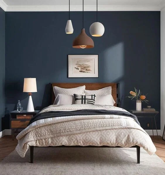
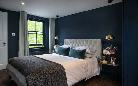
So, we are not being biased when describing by far the most popular colour, The Blue! Yes, we know that DM Designo’s colours are blue (and white) blue was chosen because both of us, Darya and Duna love this colour, it is our favorite colour. Which is odd because we tend to go against what usually is popular but when it comes to colour we are all about this beauty that is associated with, are you ready, are you really ready? Ok, here we go it is associated with trust, confidence, intelligence, and loyalty. Shall we say more? Yes, we will. Blue is known to have calming effects, it slows down metabolism and is considered to be beneficial to the mind and body when used in home and office interiors. The physiological effects are the decrease in blood pressure and heart rate. The shades of any colour are important so always keep that in mind when choosing. At DM Designo we love using deep blue for bedrooms as it creates a luxury feeling. A lighter blue can be a good option for the office as it creates feelings of tranquility and is associated with understanding and softness. If the lighter shade of blue is chosen natural light has to be present, if not, it can make a space come across as cold and chilly. Dark blue is another good option for office spaces as it represents knowledge, integrity, power, and seriousness. Can you tell how much we love this colour?!


The passionate colour known as red – is a colour that evokes feelings of desire, passion, and love, at the same time it can generate emotions like energy, danger, strength, power, and determination. Each of the different emotions is influenced by the different shades of red. Where does DM Designo usually use red? Let’s start by saying that we hardly use it, but when we do, you will find us using it as an accent colour.

Having said that, painting an accent wall in your kitchen red could be a good option depending on the way you want to use your kitchen space. In a kitchen where things can sometimes feel cold, an intense shade of red can bring warmth to the space, and it is known to increase appetite, it increases your energy, stimulates conversation , and creates excitement. As you can see those are all psychological relations with colour. If you are still wondering where you can use red (because it is your favourite colour) apart from the kitchen, it can be a good choice for your front door. Red makes a great first impression.


RED_PAINT _KITCHEN_INTERIOR_DMDESIGNO_BLOG_1.jpg
 

Yellow, the colour of sunshine! Typing the word on its own brings a smile to our faces. That’s with the black ink, let alone when the colour itself is present. Yellow is associated with happiness, joy, intellect , and lots of energy. Disclaimer: people are known, more likely to lose their temper in an all-yellow interior, so it needs to be used sporadically.

Where in your home and offices do you want to be using yellow? For the home, it is a great choice for dining rooms (especially for breakfast spaces) and bathrooms, always when it is in the right shade of yellow.

Using yellow in hallways can feel welcoming both in homes and offices. A light shade of yellow is also a great choice for the exterior of the house. Bonus: add grey to a deep yellow and you will have sophistication.


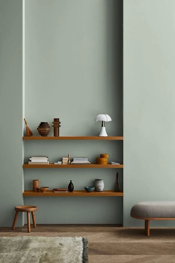
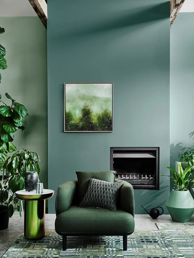
The earthy colour – Green! The colour of nature and calmness. Did you know that green is considered the most restful colour for the eye? Well, you do now : )

When used in interior design green can transcend a sense of calmness and safety. This is probably one of the most versatile colours and the only colours that can easily be used for every room in the house, always when the shade is right. Even when used for decorating it has calming effects.

If you are looking for a colour full of contrast, here it is it can add richness, drama, and balance all at the same time. Bonus: if you are looking for a modern aesthetic pairing light green and gray can be your answer!


Photo: Lisa Cohen | Styling: Bree Leech l Source: Homes to Love

Photo: Lisa Cohen | Styling: Bree Leech l Source: Homes to Love

 
Photos by Lily Glass, Concept/Production l Styling by Julia Wester l Source: OH JOY!

Photos by Lily Glass, Concept/Production l Styling by Julia Wester l Source: OH JOY!

The only colour that takes its name from an object – Orange! This colour has only moved up on the ladder in the last decade in interior design. It is a colour that you either love or extremely dislike. Orange is fun and playful. It is a good option for the kitchens and living rooms used for entertaining as it encourages social interaction in a fun conversational way and great for kids playrooms especially as it represents physical comfort, stimulation, and feelings of abundance.

We don’t suggest using it for spaces where you want to work, unwind, relax, or sleep. Bonus: if you are hesitant about the overpowering effect of orange try using it in small bursts, such as in your accessories, and see how it feels.


We hope this is a helpful guideline when deciding on colours for your home it is important to find the colour and specific shades that resonates with your personality/ies. Keep in mind the saturation of colour plays a big role in the intensity of the psychological qualities you will feel. The proportion you use, the placement, and the combination with other colours are so very important. Most importantly is how these colours make you and your family feel, that is why at DM Designo studying the colour for each of our projects is a must to create the colour palette suited for each tailored home. 


BLOG GALLERY